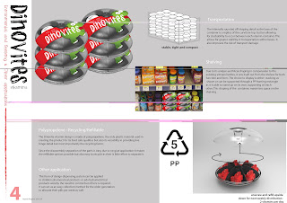
The following questions were the aim of obtaining
feedback.
1.
What
are the issues, difficulties or problems that my peer group found in
understanding or interacting with my design, as expressed by my mock-up and
posters?
- The referencing to the company logo has to be added to show the work is for the client.
- Overpowering text, simplify it as pictures speak lower than words.
- The scaling of the product with in the context of use as to be reduced.
- Improve the conciseness of the writing and enlarge the context of use on to one poster as it’s the main advantage to the design functionality.
- Look at the possibility of the door begin automatically opening on twist or having an other slot that is always open so there is the elimination of the door.
- The concept that the child had to interact thus the purpose to the live hinge door to allow for the child to seem as they were independent wasn’t clearly stated and missed.
- Increase the hands to demonstrate the usage
- Show the live hinge in the exploded view as had to be searched for within other posters.
- The clip on the door wasn’t visible enough, increase its size or indicate its location.
- Consider the shelving through having a pp made modelling holding the vitamins on the shelf showing the labelling.
-
The reorganisation and making the text more concise will be reviewed as such to highlight the context of use on an individual page whereby the benefits and values will connect with environmental advantages.
- Creating a clear message of the child’s interaction but the parents functional selling of the vitamin bottle.
- Look at the spacing of the posters avoiding the tightness of the text.
- Include more photo representation as in the research component such as the existing bottles etc. to set the emotional problem.
- Look at redesign the handle clipping of the live hinge door.
- Set the project as exclusive to the Cormack client through the exhibiting their logo on the poster.


No comments:
Post a Comment