Nicholas Baroni
Mikee Ronquillo
Andrea Krakovska
Henry Treloar
Monica Llu
Monday, October 15, 2012
ComPact Luggage Design
The ComPact Luggage design solution aims to encourage the
use of a luggage rental system by providing a convenient and compact
transportable baggage alternative to avoid the storing of expensive and bulky
luggage at home which is used once or twice a year. Also avoiding disposal due
to infrequent use which may otherwise contribute to the ever growing landfill.

The design allows consumers to travel to and from the airport
with easy to transfer hire luggage. This design avoids the hassle of organising
return as it’s obtained and returned at the international/ domestic
airports. Whilst the small, flat packed
bag design has the ability to be mailed to the consumer immediately once
ordered, increase the productivity of the luggage bags rentals and minimising
storage capacity for the consumer.
 Service

The service is the ability for consumers to participate in luggage
hire services with much needed convenience. The service hires out the expensive
hard shell casing desired by consumers for the ultimate security and durability
needed for the time spent on holidays. The service provides this additional
insert luggage design to enrich the systems service in obtaining, returning and
storing with a stylish advantage.

This design is made of polypropylene plastic which has
both environmental benefits and social benefits. This material has the ability
to be recycled with the light weight characteristic that benefits mailing and transporting
for the consumer. It is able to provide the required stiffness for this design and
stylish appeal.

The compatibility provides a great advantage for the
consumer using this system due to minimum storing ability and neat organisation
advantage. The soft but stiff biodegradable material for the main casing allows
easy mould ability and flexibility.

The colour scheme is kept corporal, simple and sleek with
the subtle detailing linking to its sophistication. This is to say that the
baggage made of PC/ABS shell design would replicate this design to act as a
family of product for the service system. Same goes for the RFID card that is
design with the addition rubber strips on the side to activate the key as a
locater for their luggage. This assist in gripping and the contrasting texture allows
for durability due to extensive usage due to the sharing system.


Sunday, September 16, 2012
Review: Who killed the Electric Car?
This video was one of
the most intriguing and engaging documentary about the electric car evolution.
From the beginning, you are captivated to find out the reason as to its
depletion and its value to the environment according to different people. It was
development in 1996 in California as a vehicle that required fast speed with no
exhaust or gasoline, quiet and home charged. It was adapted with success but
all of a sudden it disappeared. Ten years later there was no such ‘futuristic’
car on the road it had disappeared from the consumer choice.
The video illustrates
how the power of the combustion engine was seen always to be the number one
choice, even though the apparent signs of environmental struggle were becoming increasingly
notable. The Greenhouse gases, smog, air quality, ‘black cloud of death’
leading to the increase of asthma/cancer rates, lung impairment, respiratory
disease thus limitation on living. Although it wasn’t until the advancement in
technology allowing the first solar car to arrive, which lead to a mandate
whereby all car dealerships had to provide a percentage of cars with no exhaust
(Electric cars) to continue selling. Thus the EV1 was introduced to save our
planet.
You discover that the
EV1 had redeemable qualities such as sexiness, low cost, speed, aesthetic and
independency. Although consumer acceptance was an issue, questioning its
reliance, ability, size, features with the addition of conflicting oil
companies, questioning the environmental dubious of the electric car (coal).
This then caused change in the mandate to customer demand. Gone…..
The video conducted a
continuous debate trying to provide blame to the reason behind the abolishing
of the mandate thus the refuge of all electric cars. You learn the extent of how
much the environment was valued according to all parties of blame, from the consumer,
batteries, car companies, government etc. The most convincing point seen as
reasonable blame is from the car companies whereby the electric cars not having
an internal engine removed their economical profits on the repairs, maintain
and oil imports.
1.
The
harm we do on the environment has to be made clear to consumers. In educating
the understanding on how a product can help through experience and knowledge
will influence the demand. Demand is dependent on awareness thus the success of
a product in order to make a difference on the environment.
2.
Providing
a continuous debate on blame doesn’t achieve necessary action but seems to
result in the depletion of an electric car and potential market for new
innovations.
Economy and hidden agendas of the government,
politics, car companies etc. in regards to profit take a big part in the
success of the electric car.
3.
Educating
the consumer to move away from their mindset that eco design is worse than
existing products but the same with added beneficial qualities.
Sunday, September 9, 2012
Rationale – DinoVites
Problem:
The redesign of children’s vitamin containers was seen as a
necessary, purposeful design issue to resolve, fitting in with requirements for
the Cormack packaging competition. As parent’s foremost priority is in the
health and safety of their children. One of their biggest fears when exposing
their child to vitamins is the risk of overdose due to the lack of knowledge on
dosage and the lack of supervision – what happens when you are not looking.


Design Solution:
DinoVite vitamin bottle design is a new innovative approach to vitamin dispensing. It provides a controlled vitamin dispensing system for a 2 week cycle vitamin dosage for a child whereby the child is able to engage in obtaining a daily dosage under the watchful eye of a parent controlling its accessibility.

From the exterior of the design the centralised button is connected to the wheel within the design
separating the vitamins. The operation of the container is easy to use and sufficient. This is not a complicated combination,
only the strength of adult for child safety. It requires sustained push down
pressure and then a twist motion to allow for the transfer of vitamins to the
access point. With the use of a spring based system, it releases the wheel from
a locked position in the ribs in the top casing and slots into the next set
firmly therefore next day dosage. The ribs are rounded to making the transition
from slot to slot easier and easy for
parent to use on a busy schedule. This action is controlled by a parent as
to when it’s down so the child has the experience of opening the door to the
allocated amount.


The design consists of a central wheel which allows the division of the vitamins per day. It encases space only for 2 vitamins per slot meaning per day for a child above 5 years old. This allows the parent to not fear of over dosing their child when refilling the container as it will only dispense the 2. The wheel allows separation of the vitamins restricting the child’s access when obtaining themselves after the mother has set the dosage.


The colour of the wheel has the potential to be changed according to the vitamin contained creating a unique selling point. Colour coding – orange = vitamin C, blue = Omega 3, purple = minerals. Association can be created to identify with contents.
The way it sits on the shelves, it is supported by an addition moulded casing to stand vertically enabling it to be viewed at full impact of its rounded nature, so when glancing to the shelves it standouts for the tall, slender bottling. It also has the ability to stack due to the balancing of the container, bottom smaller than top half and the base feature curving inwards is the same dimensions as the wheel button that sticks out, allowing nesting. This makes transport more stable and storage within medicine cupboards.
The way it sits on the shelves, it is supported by an addition moulded casing to stand vertically enabling it to be viewed at full impact of its rounded nature, so when glancing to the shelves it standouts for the tall, slender bottling. It also has the ability to stack due to the balancing of the container, bottom smaller than top half and the base feature curving inwards is the same dimensions as the wheel button that sticks out, allowing nesting. This makes transport more stable and storage within medicine cupboards.
Since the design of the container is in two parts, combined together through the use of a screw thread it allows for further
design development whereby the texture
can reflect what is within. For example fish scale for omega 2, orange skin for
vitamin C etc. This is to say this design
application can be taken for child pharmaceuticals or older generation
medicine containers were control of daily dosage is required under the
supervision of a nurse.
The DinoVite container is made from polypropylene which makes it a recyclable
product when it comes to the point of end of use. This material allows for the
possible design detail of a live hinge door on the bottom casing. This
simplifies the design for the ability for a child to access the vitamins
independent with a click in and out motion whilst the parent has the control of
dosage and the time to administer. The whole container being made with no glues adds to the recycling
processing as it reduces time spent in the disassembly of the
parts and the harm to the environment. All parts are injected moulded making
the production run much faster and efficient for the mass production of this
product.
Tuesday, August 14, 2012
Pre Final Posters & Focus Group Exercise


The following questions were the aim of obtaining
feedback.
1.
What
are the issues, difficulties or problems that my peer group found in
understanding or interacting with my design, as expressed by my mock-up and
posters?
- The referencing to the company logo has to be added to show the work is for the client.
- Overpowering text, simplify it as pictures speak lower than words.
- The scaling of the product with in the context of use as to be reduced.
- Improve the conciseness of the writing and enlarge the context of use on to one poster as it’s the main advantage to the design functionality.
- Look at the possibility of the door begin automatically opening on twist or having an other slot that is always open so there is the elimination of the door.
- The concept that the child had to interact thus the purpose to the live hinge door to allow for the child to seem as they were independent wasn’t clearly stated and missed.
- Increase the hands to demonstrate the usage
- Show the live hinge in the exploded view as had to be searched for within other posters.
- The clip on the door wasn’t visible enough, increase its size or indicate its location.
- Consider the shelving through having a pp made modelling holding the vitamins on the shelf showing the labelling.
-
The reorganisation and making the text more concise will be reviewed as such to highlight the context of use on an individual page whereby the benefits and values will connect with environmental advantages.
- Creating a clear message of the child’s interaction but the parents functional selling of the vitamin bottle.
- Look at the spacing of the posters avoiding the tightness of the text.
- Include more photo representation as in the research component such as the existing bottles etc. to set the emotional problem.
- Look at redesign the handle clipping of the live hinge door.
- Set the project as exclusive to the Cormack client through the exhibiting their logo on the poster.
Monday, August 6, 2012
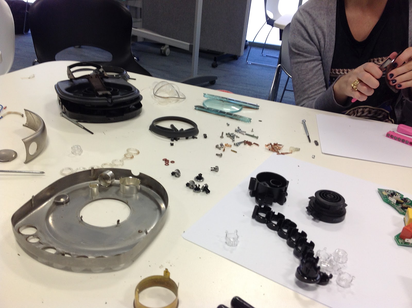
Design for Product Lifetime
Today’s team exercise was aimed to see how looking at a products
assembly and the effort behind its dismantling contributes to the environment
impact. It was interactive experience allowed us to see how the way we design impacts
the life of a product. It demonstrates how the more difficult the disassembly
and repair to recycle etc. the more likely the company doesn’t engage in its recycling
as it cost more to commute with no market share gain as time can be spent creating
a new one with profit. Seeing how its design, in terms of the amount of
fasteners, materials choices, finishes and manufacturing processes impact its possibility
to be even recycled or ending in landfill to begin with.
As a team we analysed the design of a Breville Kettle, looking
at the time of its disassembly…..1hr 16min 20sec 27ms and its difficulty in
order to discovering possible solutions of improvement. We are to see how we
could improve its disassembly &recycling – in terms of materials
minimising, fastening standardising, component limiting (litre indicator), combining
features (5 buttons to 1), reducing manufacturing
process (welding nozzle to main form), eliminating glues and aesthetical purpose
parts, clear recycle labelling in order to encourage repair& upgrade –
easier disassembly and standardising fixing encourages repair and upgrades of
internal components (element) whereby the main kettle form that doesn’t change
over time leading to improving durability –allowing for extended use of life
were by internal component change and advance with existing main structure.
The below photos demosntrate the experince of difficulty and amount of matierals involved in the disassembly. Also the displaying the overall sketch solutions and exploration.


Subscribe to:
Posts (Atom)